Responsive web design has become a fundamental requirement in modern web development. With users accessing websites from smartphones, tablets, laptops, and large screens, building websites that adapt seamlessly to different devices is no longer optional. Search engines, users, and businesses all expect responsive and mobile friendly experiences.
In 2026, responsive web design goes beyond flexible layouts. It focuses on performance, accessibility, usability, and consistency across devices. This article explores responsive web design in detail, including best practices, essential tools, and modern frameworks every web developer should know.
Table of Contents
What Is Responsive Web Design
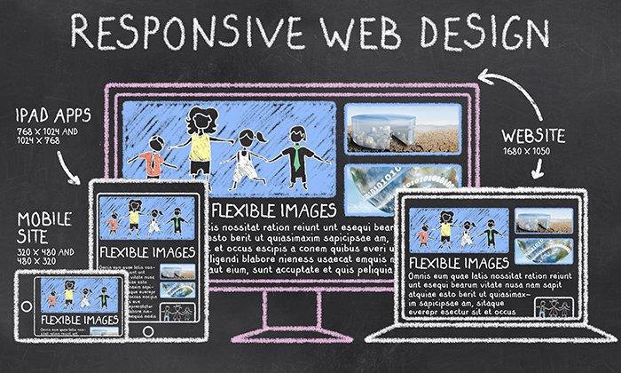
Responsive web design is an approach to building websites that automatically adjust layout, content, and functionality based on screen size and device type. Instead of creating separate websites for mobile and desktop users, responsive design uses flexible grids, fluid images, and media queries to deliver a single adaptable experience.
This approach improves usability, reduces maintenance costs, and enhances search engine visibility. According to Google’s mobile friendly guidelines, responsive design is the recommended method for building mobile optimized websites.
Why Responsive Web Design Matters in 2026
Mobile First User Behavior
A majority of global web traffic now comes from mobile devices. Users expect websites to load quickly and function smoothly on smaller screens. If a website fails to meet these expectations, users are more likely to leave, increasing bounce rates and reducing conversions.
SEO and Search Engine Rankings
Search engines prioritize mobile friendly and responsive websites. Google’s mobile first indexing means that the mobile version of a website is considered the primary version for ranking and indexing. Responsive design directly contributes to better SEO performance and improved search visibility.
User Experience and Accessibility
Responsive websites provide consistent navigation, readable text, and touch friendly interfaces. This improves accessibility for users with different abilities and ensures compliance with modern web accessibility standards.
Core Principles of Responsive Web Design
Flexible Grid Layouts
Responsive layouts are built using flexible grid systems that adapt to screen sizes. Modern CSS techniques such as Flexbox and Grid make it easier to create dynamic layouts without relying on fixed widths.
Developers can learn more about these layout systems from MDN Web Docs, which provides authoritative documentation on modern CSS standards.
Fluid Images and Media
Images and media elements should scale within their containers to prevent overflow and layout breaking issues. Using responsive image techniques ensures faster loading times and better visual consistency across devices.
Media Queries
Media queries allow developers to apply different styles based on screen size, resolution, and orientation. They are a core component of responsive design and enable fine grained control over layout behavior on different devices.
Mobile First Design Approach
Mobile first design means designing for smaller screens first and then progressively enhancing the layout for larger screens. This approach forces developers to prioritize essential content and functionality, resulting in cleaner and more efficient designs.
Mobile first design also improves performance because smaller devices load fewer resources initially. This aligns well with modern performance and SEO requirements.
Best Practices for Responsive Web Design
Use Modern CSS Techniques
CSS Grid and Flexbox have replaced older layout methods such as floats. These modern techniques simplify responsive layout creation and improve maintainability.
Frameworks like Tailwind CSS provide utility based classes that make responsive styling faster and more consistent across projects.
Optimize Typography for Readability
Readable typography is crucial for responsive design. Font sizes, line heights, and spacing should adapt based on screen size to ensure comfortable reading on all devices.
Test Across Devices and Browsers
Responsive design must be tested on multiple devices and browsers to identify layout and usability issues. Browser developer tools and real device testing help ensure consistent experiences.
Prioritize Performance
Performance is a key part of responsive design. Optimizing images, minimizing CSS and JavaScript, and reducing unnecessary assets improves load times and user satisfaction.
Popular Tools and Frameworks for Responsive Design
CSS Frameworks
CSS frameworks simplify responsive development by providing pre built components and grid systems. Popular options include Bootstrap and Tailwind CSS, both of which offer strong responsive utilities.
Frontend Frameworks
Frontend frameworks like React and Vue.js allow developers to build responsive interfaces using reusable components and state driven rendering.
Design and Testing Tools
Tools such as Chrome DevTools help developers test responsive layouts, simulate different screen sizes, and debug performance issues efficiently.
Responsive Web Design and Accessibility
Accessibility and responsiveness go hand in hand. Responsive websites must support keyboard navigation, screen readers, and proper contrast ratios. Following accessibility guidelines improves usability for all users.
Developers often refer to Web Content Accessibility Guidelines to ensure compliance with global accessibility standards.
Future of Responsive Web Design
In 2026, responsive design continues to evolve with new CSS features, container queries, and performance focused development practices. Container queries allow components to adapt based on their parent container rather than the viewport, offering more flexible design possibilities.
As devices and screen types continue to expand, responsive web design will remain a critical skill for modern web developers.
Final Thoughts
Responsive web design is no longer just about fitting content on different screens. It is about delivering fast, accessible, and user friendly experiences across all devices. By following best practices, using modern tools, and prioritizing performance, developers can build websites that meet both user expectations and search engine requirements.
Mastering responsive web design not only improves website quality but also strengthens a developer’s career prospects in an increasingly competitive web development landscape.
Also Check Modern Web Development Stacks – Comprehensive Guide – 2026
1 thought on “Responsive Web Design in 2026 – Best Practices, Tools, and Frameworks”